 Call
us: (610) 594-2394
 Call
us: (610) 594-2394


Remember that song from Sesame Street, “One of These Things Is not Like the Others?” While it’s a sweet song and probably brings back fond memories, you don’t want that song to pop into your head when looking at a new home addition. In fact, probably the best compliment that you could get on a home addition is that it doesn’t look like an addition.
Sometimes you look at a house and can tell where the addition is. Maybe it is out of scale with the rest of the house. For example, it looks like a new two-story Georgian was just parked behind a petite Dutch colonial cottage. Maybe there are double hung windows on one end of the house and sliders are on the other end. It just doesn’t look right. Sometimes, you just know something is off, even if you can’t pinpoint it. That is exactly what you want to avoid with your home addition.
The key to creating a seamless look with additions is two-fold: creating a complementary architectural design and using materials that match or complement existing materials.
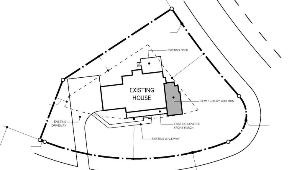
Architectural design should reflect the existing style and size of the home, so the designer should survey the existing home, and draft the house as it stands currently. City zoning requirements and property lines will also reflect the final design of the addition.
Project by Cocoon
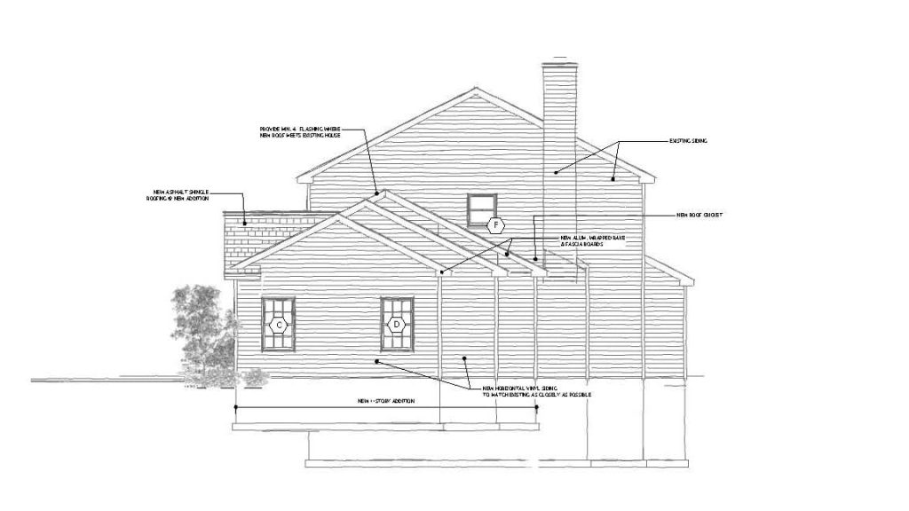
Setbacks for this property guided the placement of the walls for this in-law addition. Notice how the walls create a stair-like pattern away from the property line.
With these requirements in mind, the designer can then draft an addition that complements your home. On the inside of the addition, for example, the bedroom of an in-law suite should be comparable to the size of the existing master bedroom. A bedroom that is too large would overshadow the existing master, and one that is too small would probably not be practical. What’s more, neither of those options would be valuable when trying to resell the home.
Likewise, the ceiling heights, of course, are going to be the same from the main house to the addition. A soaring 10-foot ceiling would not only dwarf an 8-foot ceiling, but again would look awkward. While a vaulted ceiling could be an exception, it would still have to smoothly transition from the main house.
On the exterior, the pitch of the new roof should match the pitch of an existing roof. While the pitch of the roof may not the first thing you think about when considering an addition, it’s important if you want a seamless look. Mismatched pitch would be a dead give-away that the addition was not original to the house—not to mention that it would just look odd.
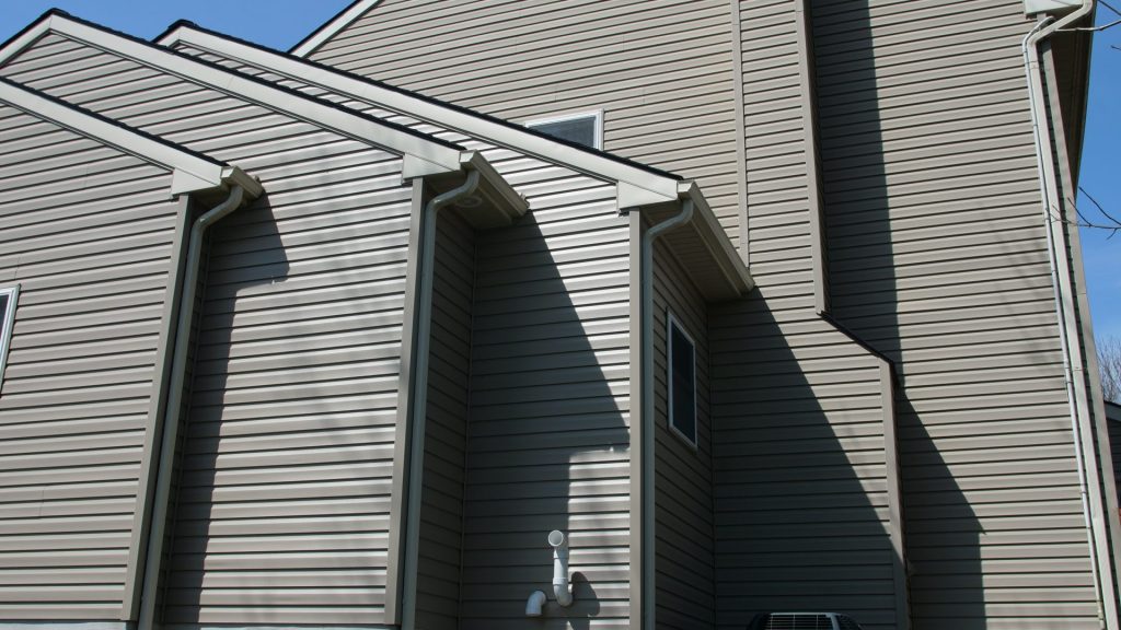
Materials matter just as much as the structure itself. Mismatched siding or an off-color roof are an obvious sign that one part of the house is not original.
Of course, matching materials exactly is not always an option. In this case you have two choices: pick a complementary look or change the old exterior to match the new.
Brick can be particularly hard to match as there are so many variations. Plus time and weather change the look of the original brick. Fiber cement siding, for example, tends to balance the look of brick and comes in a wide variety of colors to match. If you’re looking for greater continuity in your exterior, however, painting brick is also a cost-effective option that highlights the unique texture of your brick exterior.
If finding complementary materials proves to be too tricky, new siding installation for the entire home may make the most sense.
Sometimes the same is true with roofs. If you are building an addition, it may be good time to do an entirely new roof installation for a seamless look between the original house and the addition. In the Downingtown addition pictured above, Cocoon added an entirely new roof for a seamless transition from the original house to the in-law suite.
There are exceptions to this, however. For dormers, porches, sunrooms or roof overhangs, different roofing is also an option. In these areas you could use something like metal or cedar. It’s mixed media in design architecture.
Even after you decide on the size and style of the new addition, how do you know you picked the right materials or that the design will flow as well as you hope?
They say an ounce of prevention is worth a pound of cure. In the case of additions, the ounce of prevention is found in 3D modeling. This gives you the chance to do a walk-through of your new addition before you even break ground on a project. It’s a chance to prevent any buyer’s remorse later.
Are you the type of person who “can’t picture it”? Even if you are good at visualizing design and space, it’s always better to see things with our own eyes. That’s exactly what 3D models do for homeowners. They give you the confidence in not only your contractor’s decisions, but yours as well.
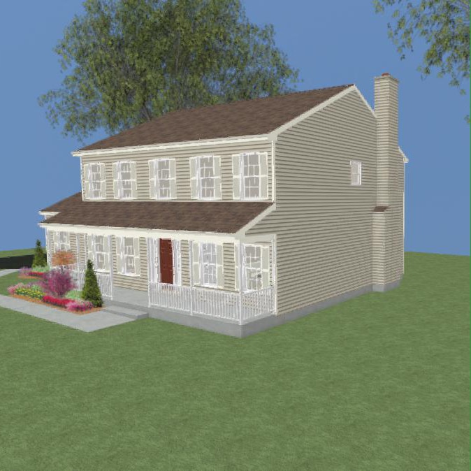
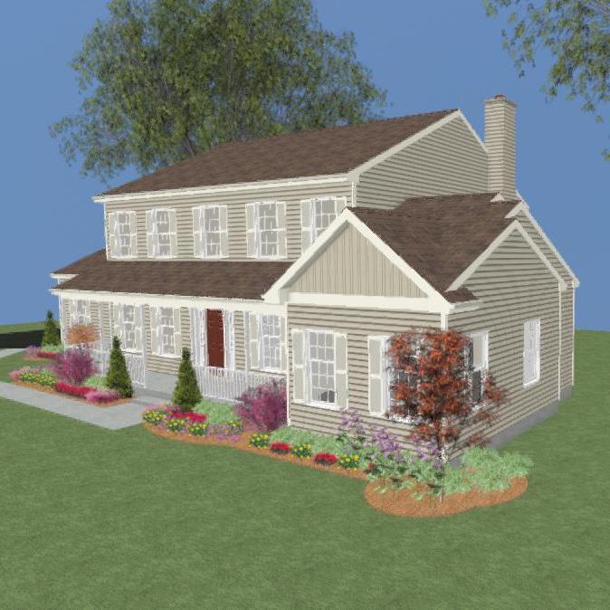
While a designer’s rendering of a space was nice to look at years ago, that rendering couldn’t give you a feel for the space. Now you “walk through” that rendering and get a sense of not only how your space will look, but, most importantly how it will feel.
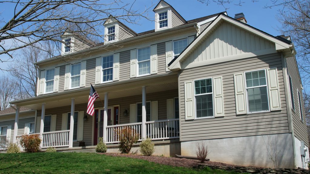
In this Downingtown in-law suite addition, both the structure and materials mimic that of the original home. (If you’re interested in in-law suites, be sure to check out this post.) The decorative peak in the front of the addition mirrors the dormers on the second floor of the original house. The roof’s pitch is in perfect sync with the original home. The siding is seemingly seamless. And the shingles are a perfect match as well.
Project by Cocoon
But the addition doesn’t simply match the original home. It simultaneously creates continuity and visual interest. For example, continuity is created in the horizontal line that moves smoothly from the roofline of the porch to the border between the board and batten and lap siding on the addition.
On the other hand, the board and batten installation on the peak of the addition complements the gray lapboard and adds varying texture and color to the home’s facade. Although the homeowner of the Downingtown addition could have chosen to continue the lap siding all the way up the front, you can see the contrast in siding adds complementary visual contrast.
The best additions not only add value to the home but enhance it. To ensure that your addition will do that, be particular about materials and pragmatic about how your current space will flow into a new space.
An addition is not a regular home remodel that can be tackled by do-it-yourselfers. Cocoon can help you design a space that meets your needs and exceeds your expectations.
