For the last several years, interior design trends seem awash in white and with good reason. It’s easy to love. It brightens a room. It feels clean. It’s classic and contemporary. When everybody loves white, however, everybody’s homes can start to look the same. Want to avoid that? Add a pop of color in your next home remodel or room makeover.
Color makes your decor unique. While everyone you know may have white kitchen cabinets and marble countertops, they may not have a cobalt blue range or sunny yellow backsplash. Color infuses a room with personality and it makes those pretty white finishes pop even more.
Color provides contrast. While some monochromatic white rooms can stun with varying textures, others fall flat. You can avoid that by adding color to your room. Accessories and textiles in persimmon or teal add interest amid an otherwise peacefully neutral room.
Color can help your mood. You may relate certain colors to happy memories or favorite places, so says this Psychology Today article. Red might remind you of your favorite ice cream shop. Turquoise may remind you of your Caribbean honeymoon. So go ahead and add a dash of your favorite color in your home.
Adding color can be simple. There are so many ways to do it. The easiest ways to add color are accessories, paint, and hardware. Of course, some pops of color may be more permanent, such as tile or appliances, but these options also tend to be the most striking. The good news is that color can be suited to every budget and taste. Whether you prefer a permanent statement piece or a few accessories, there’s no reason to hesitate.
If you have lived with an outdated kitchen for many years, your number one home goal is to remodel it. As the hub of the home, your kitchen should stand out. It’s where you gather every night and where your guests linger at parties and holidays. Give yourself and them a space to admire.
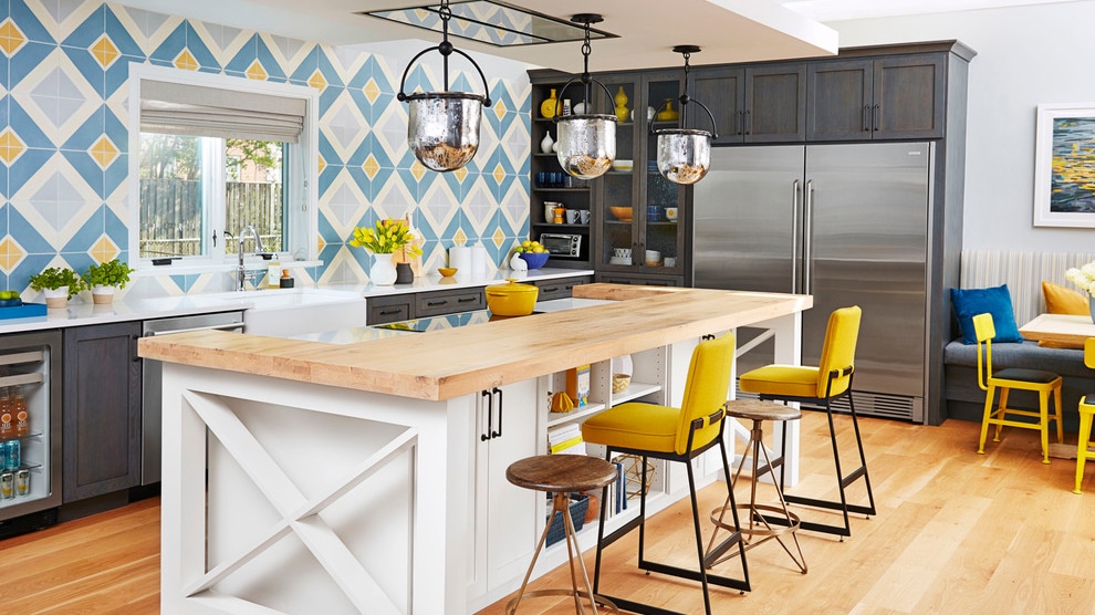
You can have the best of both worlds! Classic Shaker cabinets appeal to the homeowner’s practical side, while playful pops of color coax a smile from everyone who enters this room. And the pops don’t stop at the backsplash. Marigold barstools and chairs connect the bold backsplash to the rest of the kitchen. Along with the gray and white cabinets, neutral walls and light woods create contrast and warmth.
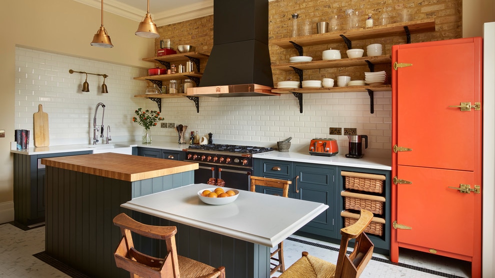
Project by Harvey Jones Kitchens
Contrasting cabinets and countertops, along with at least two focal points, create drama in this otherwise modest kitchen. A combination of wood and metal accents add warmth to the cool white floors, countertops and backsplash. Brick and beige walls also balance the stark contrasts of white, black, and slate gray. A soaring black range hood accented with lustrous copper commands attention. The orange refrigerator, another eye-popping feature, provides just the right amount of whimsy.
Project by Maria Tenaglia Design
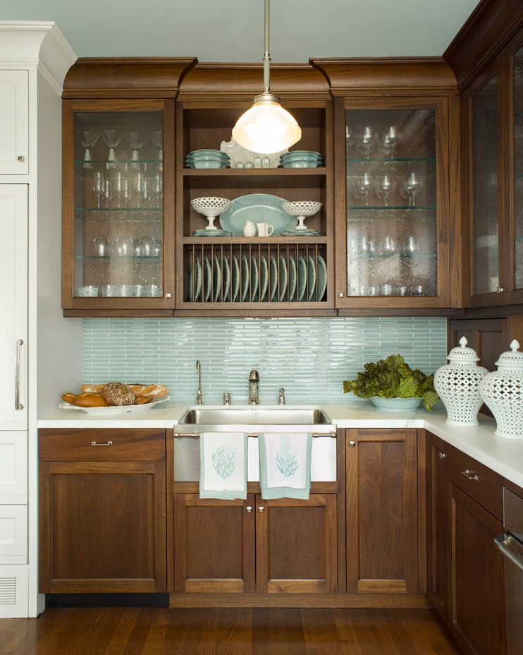
While white makes a beautiful backdrop for any color, wood cabinets complement color just as well. These cool, aqua glass tiles contrast the warm cinnamon cabinets in this transitional kitchen. The soft aqua extends to the hand towels, serve ware, and even the ceiling, bringing the look together from top to bottom.
Project by Andrea Schumacher Interiors
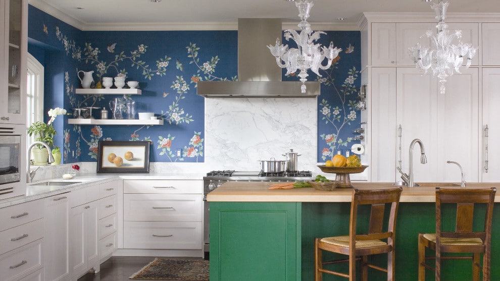
Green and blue infuse this otherwise white kitchen with with jewel-toned hues. The emerald island, with its butcher block countertop and rustic barstools, brings the outdoors in and complements the blue, floral wallpaper. The combination of a floral wall, a green island, and white cabinetry creates a colorful elegance.
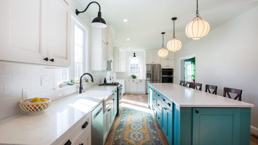
Project by COCOON
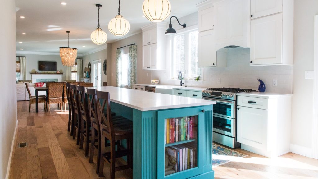
Subdued gray walls and classic white cabinets create a muted backdrop that lets the Caribbean-colored island pop. Check out the story of this coastal-inspired Gilbertsville remodel.
Tile may be the obvious way to add color to your bathroom, but it doesn’t have to be the only way. As with kitchens, you can color with cabinets, cutouts, flooring and more. (Contact COCOON to discover the myriad of ways we can help add pop to your next home remodel.)
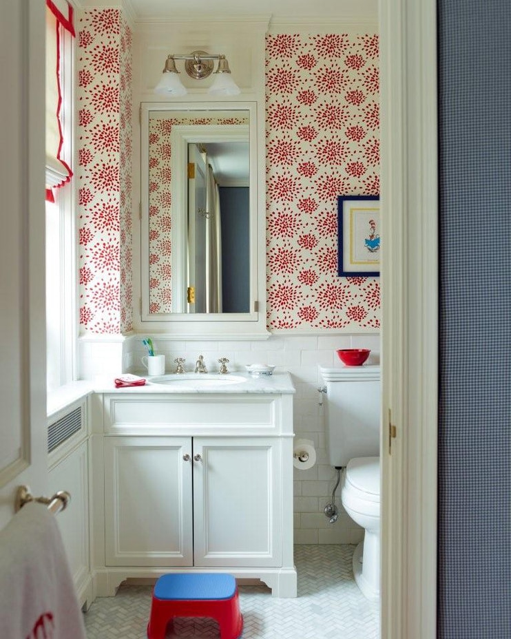
Project by Studio 511
A recessed panel vanity, herringbone tiled floor, white subway tiles are a beautifully classic backdrop to the firework-inspired design of the wallpaper. Bold, yet not overbearing, this red wallpaper is sure to spark joy.
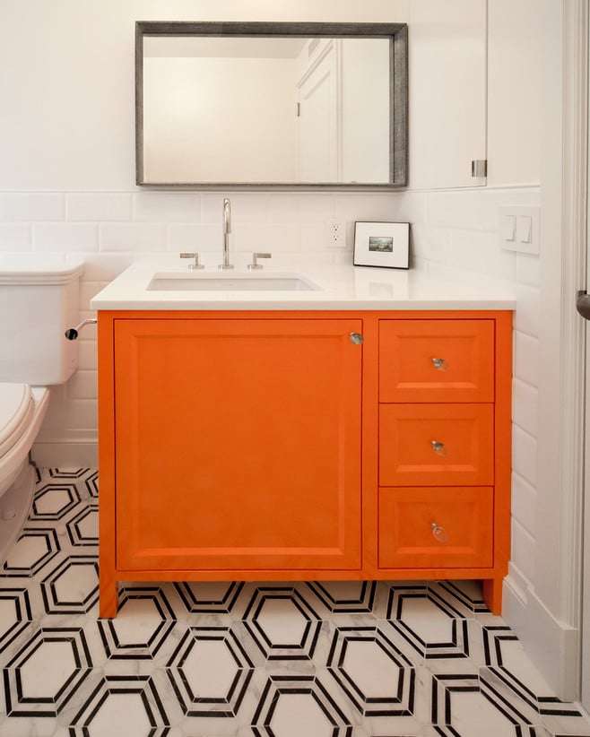
Project by PACS Architecture
Again, white provides the perfect setting for a pop of pigment. White walls and a large-scale hexagon tile lay low and let this persimmon vanity steal the show.
Project by Butler Armsden Architects
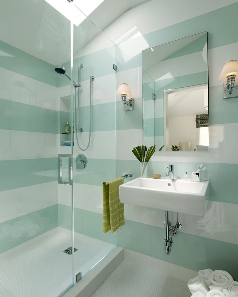
Cool, clean, and modern, these bold aqua stripes lend a playful yet serene vibe to this bathroom. Creating large scale patterns in soft hues like these are an easy way to infuse color into a bathroom remodel without saturating the space.
Project by Bearded Builders
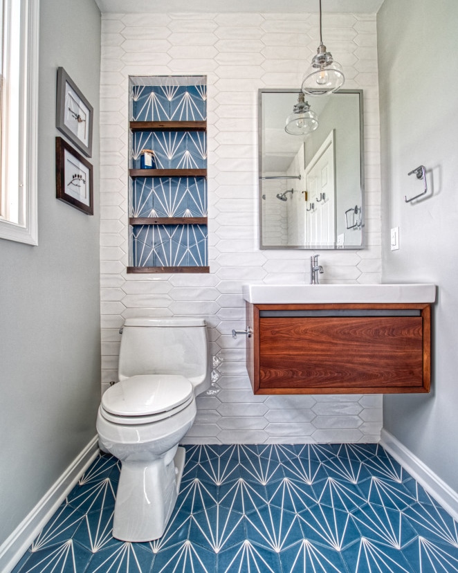
Small rooms, such as this bathroom, can be a great place to place to add loads of color. You get the fun of a new hue, without having to commit to it on a grand scale. The geometric teal floor tile immediately steals all the attention, while the teal-accented alcove ties together the wall, floor, and the wood.
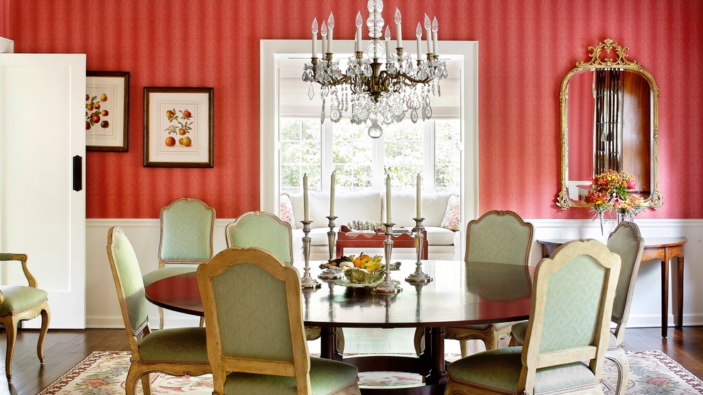
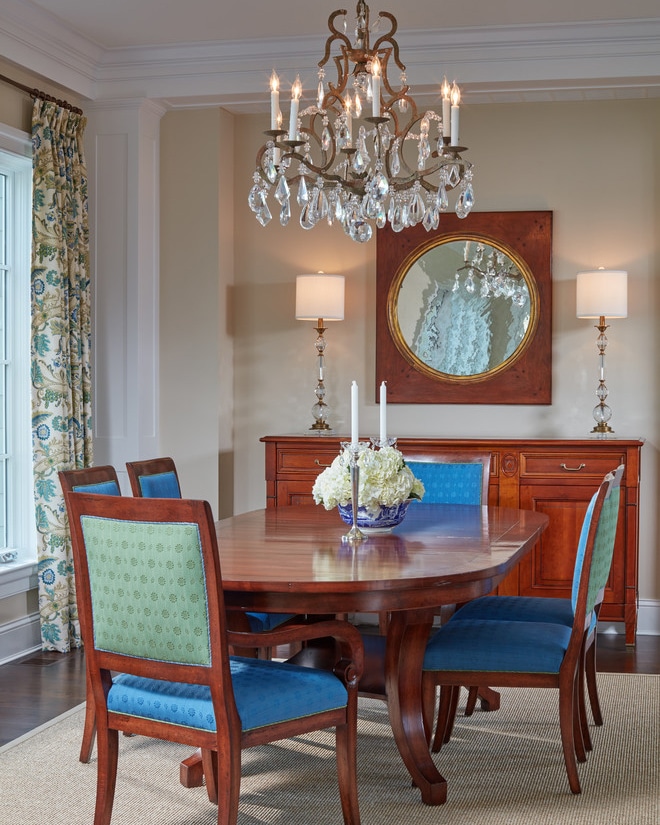
Reserved often for large dinner parties and holidays, dining rooms are conducive to dramatic shades. Colorful dining rooms set the tone for special occasions.
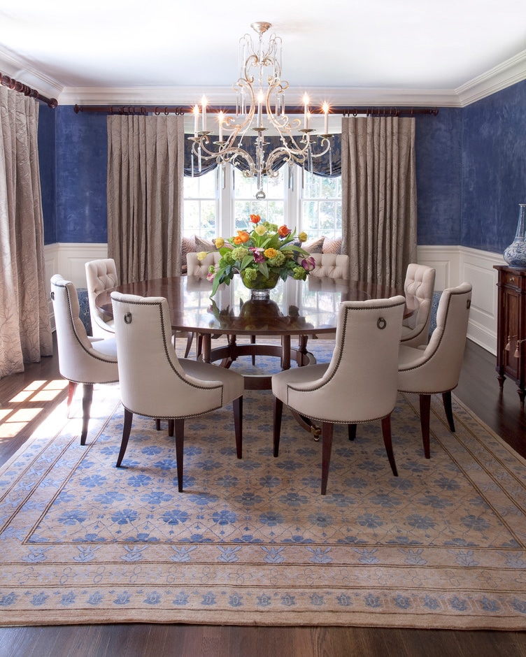
Project by Diane Gerardi Design
The textured blue walls take their cue from the cornflower blue accents on the rug. The classic combination of cream, taupe, and blue invites guests for memorable get-togethers, great conversation and tasty food.
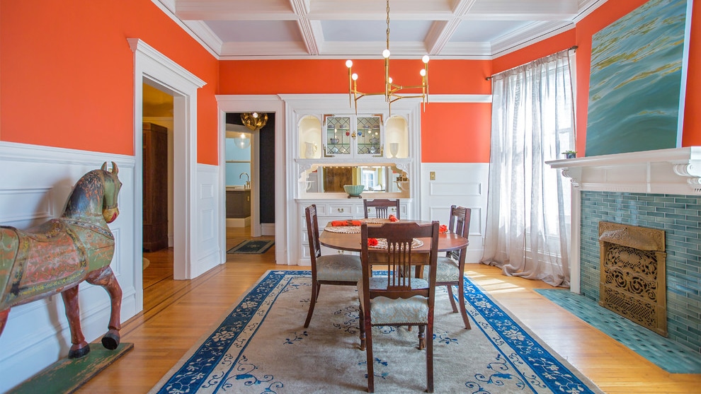
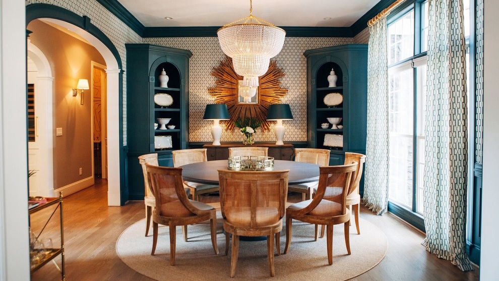
Project by William Adams
Whether the occasion is special or or casual, this lively dining room can easily charm friends and family. Anchored by the traditional white wainscoting and coiffured ceiling, orange walls and turquoise accents positively pop. Airy curtains, simple lighting, and an unassuming table ensure attention stays on the color.
As opposites on the color wheel, the orange walls and turquoise tiles and painting create visual balance. You could having Thanksgiving dinner here or play Monopoly. Formal and casual design elements create a perfect harmony.
Project by R. Scott Javore & Associates, LTD.
If pop psychology is to be believed, these red walls will energize guests. Now that makes for a fun gathering! The vibrant walls are tempered by celery green chairs and white woodwork.
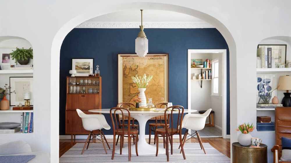
Project by Purple Cherry Architects
If you don’t want to commit your walls to color, but don’t want your room void of it, add color with upholstery and drapes. In this dining room, blue and green upholstered chairs tie in with the pattern on the drapes. The beige walls and white trim neutrally await any other pops of color the homeowner decides to add to this traditional dining room.
Project by Georgia Street Design
Believe it or not, painted trim does not have to be white! The deep teal built-ins and trim turn a traditional look on its head. (And they probably turn guests’ heads, too!) The white curtains and walls lend some lightness to the room, while the honey-toned floor and table add warmth. Though the woodwork here is traditional, the color of the wood is anything but.
Notice, too, that the trim in this adjacent rooms is white. You can keep your home fairly neutral, while still adding some drama when necessary.
Project by Ginny Macdonald
Ocean blue combined with crisp white creates a clean setting for any gathering, and carmel-toned woods and golden accents add warmth. The unfussy furniture, meanwhile, ascribes casual feel. Get-togethers here are fun, not formal.
In addition to accessories, furniture and textiles give you more easy ways to add color in living areas. That being said, if you’re feeling bold, you can paint your woodwork as well, and have some beautifully eye-popping results.
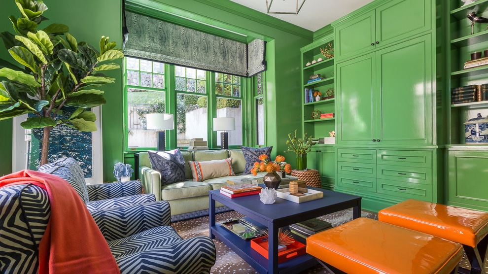
Project by Ann Lowengart Interiors
Ok, so this is more than a pop of color. It’s many pops of color. It demonstrates the dramatic effect of painting woodwork. In this case, it creates a happy, fun space. Plus, the beauty of painted woodwork is, of course, that you can repaint it a tried-and-true white, any time you feel like it.
Project by Crimson Design Associates
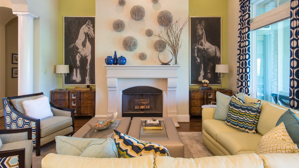
This room proves, as did the dining room above, you can have it both ways: formal and fun. The chartreuse accent walls draw your eyes straight to the the fireplace and the bold equine artwork. Subdued yellows offer a sunny, but neutral backdrop to the stark, geometric patterns that modernize the traditional architecture of this bright family room.
Project by Andrew Howard Interior Design
Once again, color livens up what could have been a stuffy room. While the indigo sofa and tiled fireplace sure are inviting, it’s the robin’s egg blue trim on the millwork and ceiling that set the relaxed vibe.
If there is any room that you may want to keep soft and neutral, it’s probably the bedroom. It’s where you wind down. That being said, it’s also where you start the day. Perhaps a pop of color could inspire you to pop out of bed.
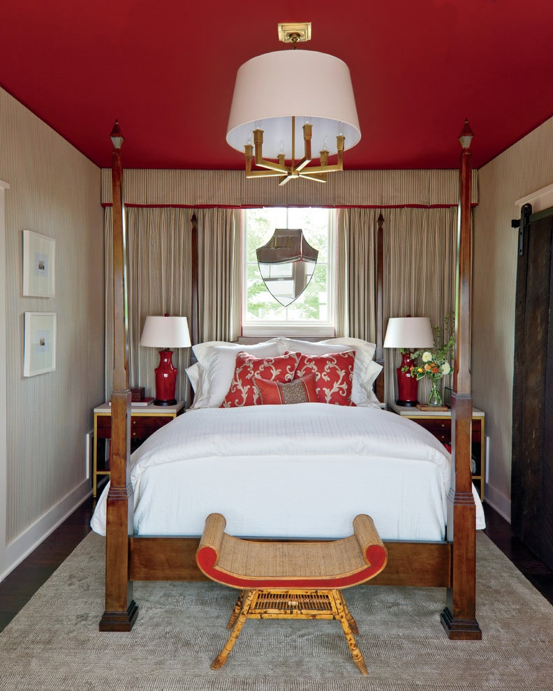
Project by Phoebe Howard
Can’t commit to painting the walls a striking color? Perhaps, you could try the ceiling. Red moves around this room, from the chair to the accessories to the curtain trim, and finally to the ceiling. The crimson ceiling tops this tiny room with ample warmth, making this bedroom even cozier.
Project by House of Brazier
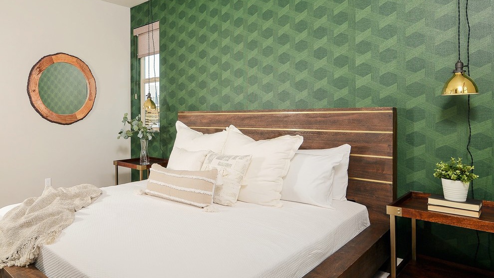
This wallpaper really wows. Its pine green geometric pattern complements the warm, contemporary headboard. The creamy bedding and walls, mostly void of pattern, neutrally contrast the feature wall.
Project by Dawson Design Group
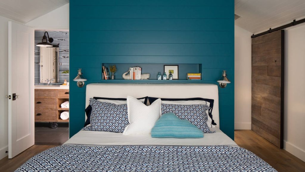
Soaring teal shiplap highlights the cathedral ceiling in this master bedroom, creating the illusion of a larger space. The bold green-blue also reflects the home’s beach-adjacent setting, reminding homeowners and guests that it’s time to relax.
Project by Chioco Design
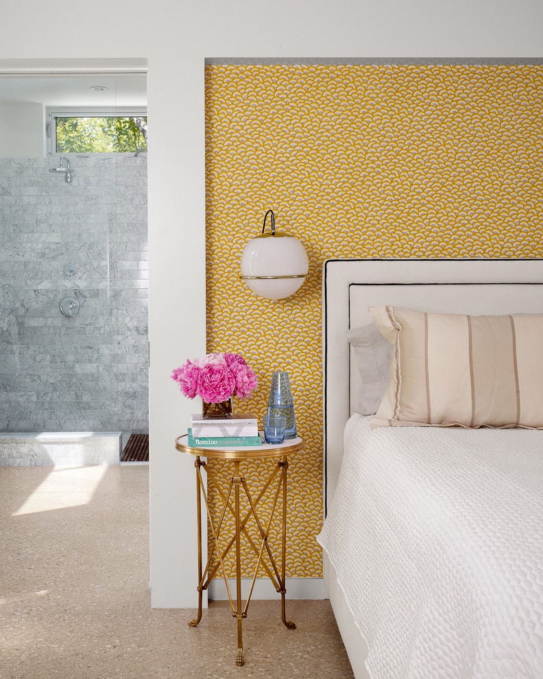
While there’s plenty of light flooding this mid century modern master, the sunny wallpaper splashes an extra does of sunshine into the room. The frame surrounding the wallpaper and headboard draws your eyes right to the color and creates a cozy nook for nighttime in this lofty room.
It can be hard to commit to color. What if you change your mind? What if you choose the wrong color? What if it’s too bright or too dark or just not what you envisioned? Many homeowners have these concerns. Just keep in mind that many design choices, such as paint and accessories, are easily reversible. However and how much you choose to color your home is totally up to you.
An infusion of color can be statement piece combined with a few accessories. It can be a balance of cool and warm colors offset by neutrals. It can be one singular element, such as the red-wall in the white bathroom above. Your infusion of color can be whatever transforms your home into your happy place.
Contact COCOON to learn how to add pops of color in all the right places for your next home remodel. Working with clients in Chester County, Montgomery County, and Delaware County for more than a decade, we can help you reimagine your house into a more colorful home.
This is an image round up post featuring work from various sources. If you do not want your work featured on our blog, please contact us at [email protected]. Thank you!